

Twitter redesigns
Yesterday Twitter got overhauled. I am not talking about some small, tiny redesign tweak; it got completely reworked from ground up. The overhaul also includes replacement terminology for old words. There are no more “mentions”, they are now called “Connect”. Hash tags are now called “Discover”. Many new things are introduced, and I will not comment on validity of those ideas. It is Twitter’s political decision to change terminology and how they present themselves to the world.
What I will comment on is the new iOS App.
It’s horrible.
Here is a screenshot of the regular timeline view.
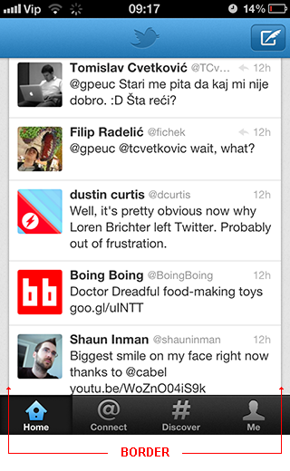
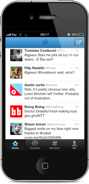
What you can notice immediately is the border around content. That border might even look OK while you are looking at the screenshot as a pure image. When you put this screenshot into the realistic environment – on the iPhone – you get this:

And you can instantly see double border. One is the software drawn border in the App, and another is hardware border, so called end-of-the-screen. Seriously, there is no need to draw vertical border when the device itself creates the border. It all just looks messy and sloppy.
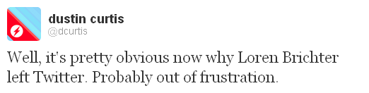
Here is just a quick fix of removing the border. I have not even re-positioned the elements to take advantage of extra space gained by this (about 20 pixels on each site). It looks much simpler and less visually cluttered.
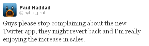
The whole Twitter for iOS App is plagued with this additional vertical border between content and edge of the screen. Why? Noone knows. But this is relevant:
In conclusion, just to say it again:
Dear iOS Apps designers. The device itself is a border. Consider that when designing.