Alarm and Bluetooth icons in iOS
I was looking at the iPhone (iOS) top system bar and one thing was bothering me in particular, but I could not place my finger on it. Yesterday I figured it out. Alarm icon, and rarely, Bluetooth icon.
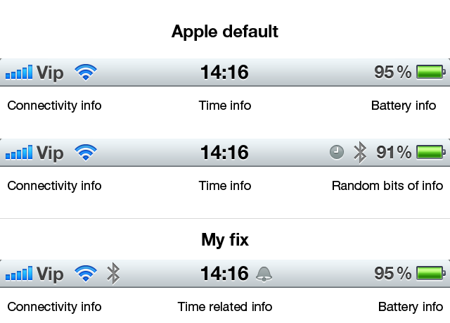
If we segment the top bar into three pieces (left, central, right) each of which has a particular info to convey, the structure is pretty clean. On the left there is info about connectivity, signal strength, wireless, 3G etc. Middle part is reserved for time, and on the right there is battery info.
The problem starts when additional icons show up, in particular Alarm and Bluetooth. The Bluetooth icon is an obvious candidate to be moved on the left side since all the connectivity is there. There is no reason to dislocate Bluetooth to the right.
Alarm icon has two problems.
First, an icon itself. Clock. Clock is a wrong communication on many levels. I can clearly remember few years ago when I first got iPhone that this icon meant nothing to me. I set the Alarm and had no idea a Clock icon means that I have an alarm setup. Throughout user interfaces of the world alarm was mostly represented by a ringing bell. This not only is a better visual communication but also is a logical translation of the ancient real-life alarms (church bells) into digital era.
Second problem is the position. When a clock icon appears next to battery icon, what does that mean? It means nothing, exactly. Alarm icon must be placed next to time, because they are both time related bits of information.
Additional Hate
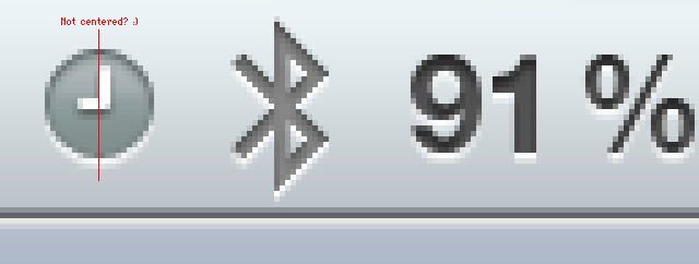
While doing this I found out this little bit of not-so-perfect design. Three icons, each of them has different shade of grayish color. How did Steve miss that one out? Also, minute-hand is not centered. My OCD is kicking in now, I have to stop dissecting these icons.


4 thoughts on “Alarm and Bluetooth icons in iOS”
March 27, 2012 at 17:30
Hmmm… Your fix looks very PC-ish, and not Apple sleek at all. ;)
Nothing intuitive about your “fix”. I for one don’t get your logic as far as the aesthetics of the whole thing is concerned – your fix just doesn’t look right. Jony Ive would get hives just by looking at that ugly bell icon. :)
April 4, 2012 at 18:45
The minute hand in the clock icon is designed optically – not geometrically. If it was designed optically (minute and hour hand in the dead centre) – it would look wrong :) The icon would have a crooked fell to it because of a hour hand on 9 o’clock that disrupts the symmetry. The same thing is with the color variations. The eye/brain perceives colors differently on a thin line/lines an on a larger surface (such as this circle on clock icon). They’ve probably set up that the colors look the same when you look at them from aprox. 30 cm. They have a funny hue shift though – the clock seems more blueish…
I do agree with the BT icon placement but this one puzzles me > http://gizmodo.com/5788166/why-the-fck-is-the-1-on-the-iphones-calendar-off-center
I’d love to hear explanation for this “feature”. So much tor optical alignment, LOL.
Bye,
K
July 14, 2012 at 19:00
Relevant: http://techcrunch.com/2012/07/14/iconoclasm/
September 5, 2019 at 12:11
Great post, but I think Apple already has an aesthetic which could easy to understand by the buyer. But it would be great if your opinion could heard by the Aplle as the sharing ideas or concept with them., isn’t it ? regards