

Optimize your logos for screen please
Goddamn, some things just throw me right off my balance. One of them is Current.com website, that no matter how good the idea is, and no matter how cool videos they have, details in execution just piss me off.
The logo – main visual identification on the site – is deployed to website so poorly that i spontaneously started to cry. The logo represents pixels, and there is no reason why designer didn’t give that half an hour extra effort to make it look superb.
This is Current.com logo now:

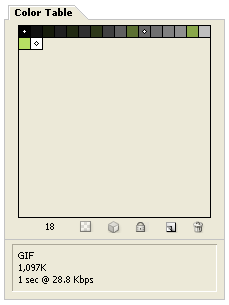
As you can see, it looks blurry, and really unprofessional. Photoshop says this about it – 18 colors palette inside 1 kilobyte:
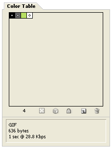
And behold now, with just 10 minutes of clicking, i made this:

Photoshop says – 4 colors palette inside 600 bytes:
For easier comparison and evaluation, here are the two logos together:
Why do lazy designers just get the logo in vectors, slap it into Photoshop, resize it, and think their job is done will never be clear to me. Monitors, especially LCD monitors which form majority of displays, require image optimization and tweaking in order to achieve polished feeling. Not to mention that lower filesize is an element too.
And also, as a side note, Current.com base-font is Helvetica. Can you designers working on Mac please take your head out of the sand and realize that 95% of users are on Windows, and most likely do not see Helvetica properly in their browsers? Read more about that in this post. I am sure that if base font was Arial, site would have at least 10% more visitors.
4 thoughts on “Optimize your logos for screen please”
May 13, 2008 at 13:12
You’re my hero daemon :)
May 13, 2008 at 15:22
I really respect guys from current.com for reading our blog and taking Daemons comments into consideration! Big respect!!!
May 31, 2008 at 18:42
Current.com changed logo =) Check it: http://www.current.com – crispy and sharp, just the way we like it.